Monday, 8 April 2013

Signed Tapestries (part 2): Weavers

The first part of this double-post looked at the inclusion of artist's signatures in tapestry designs and their subsequent weavings. This post will examine the inclusion of weavers' initials in Dovecot's practice.
Detail from Lord of the Hunt, 1912-1916 1919-1924, designed by William Skeoch Cumming, woven by John Glassbrook, David Lindsay Anderson, Gordon Berry, George Cribbes, Ronald Cruickshank, Stanley Ebbutt, Richard Gordon, John Louttit and James Wood.

Lord of the Hunt was the first tapestry to be completed at the studio, woven from 1912 to 1924 and interrupted by the First World War. It was the war that led to the poignant inclusion of the initials of master weavers John Glassbrook and Gordon Berry. Their initials are set behind a bobbin and shears on the lower border of the tapestry; not only do the commemorate the weavers, they mark the extent of weaving that had been achieved when war was declared.


Detail of The Admirable Crichton, 1927-1930, designed by Alfred Priest, woven by David Lindsay Anderson, Ronald Cruickshank, Stanley Ebbutt and John Louttit.

Detail of The Admirable Crichton, 1927-1930, designed by Alfred Priest, woven by David Lindsay Anderson, Ronald Cruickshank, Stanley Ebbutt and John Louttit.

Initials continued to be included on the front of tapestries up to 1939. The images above show the Head Weaver David Lindsay Anderson's initials on the lower border of The Admirable Crichton, with the weavers initials above the top border.

After the Second World War the practice remained the same, but at some point initials were moved to the back of tapestries. This was not a sudden change but happened gradually. The images below show the weavers' initials and Dovecot symbol (a subject for another blog post!) on the selvedge that is turned back on the tapestry.
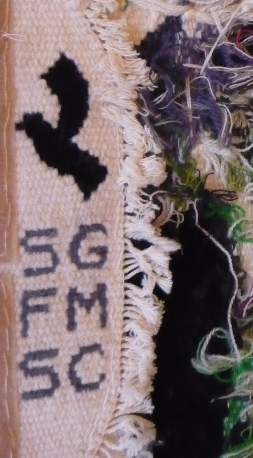

As a researcher these initial serve a practical purpose. The archival information about Dovecot's history is patchy at best. Studio weavers are at risk of becoming anonymous if their names are not recorded in surviving archives or included on the physical tapestry. Some Dovecot tapestries do not include any initials!

In recent years the studio has been at pains to ensure that this does not happen in the future. There remain some projects that do not have an appropriate space for initials, such as quick, slow illustrated in the last post. However, in most cases it is possible, as in these small Peter Blake designed tapestries woven by Naomi Robertson - her initials are on the side of the mounts:


Thursday, 4 April 2013

Signed Tapestries (part 1): Artist-Designers

Whilst researching the 1950s at Dovecot, under the Directorship of Harry Jefferson Barnes and John Noble, I came across correspondence relating to the inclusion of an artist-designer's signature in a tapestry. The artist in question was Nadia Benois. On 5 November 1955 Benois wrote to Sax Shaw (Dovecot's Artistic Director) enclosing a copy of her signature. The studio was weaving a tapestry to one of her designs, Night and Day, and she expected her signature to be included on the front.


Just a few months earlier, on 7 August, Director John Noble had written the following to Shaw about Benois' tapestry:

I am entirely in favour of tapestries being marked to show designers and weavers. It is an old tradition and a good one, interesting for posterity. But I am not sure about the wisdom of signing them on the front. I feel that it suggests 'wool pictures' rather than tapestry and that the signature is apt to get in the way of the design to a much greater extent that it does in the painting.

These letters, found in the private archive of the Shaw family, illustrates that there was no 'correct' way of incorporating an artist's signature into a tapestry design - it was constantly up for debate. I thought it would be a good idea, therefore, to survey some examples from Dovecot's history and explore the debate from 1945 to the present day.

Detail from Marine Still Life, 1949, designed by Edward Wadsworth, woven by Richard Gordon, Dovecot Studios. Private Collection.
Detail of black and white photograph of Three Figures, 1950, weavers and location unknown.
After the Second World War, the Directors of Dovecot (then called the Edinburgh Tapestry Company), decided to invite famous contemporary artists to submit designs to the studio; the Directors then selected a number of them to be woven. The Directors (all members of the Bute family) were inspired by activities in France but also encouraged by the Council of Industrial Design. It was believed that collaborating with such artists would revitalise tapestry weaving, boost its profile and make the works easier to exhibit and sell. The name of the artist was an essential part of the marketing of the tapestries.

When Noble and Barnes became Directors in 1954 they decided to move away from using external artists as tapestry designers. Instead, they employed Sax Shaw as an in-house Artistic Director and tapestry designer. It was hoped that this change would save money (from artist fees) and make the tapestries more salable in a world that was increasingly aware of 'design' in the home. However, Shaw continued to include signatures on the tapestries he designed and, of course, in the Benois tapestry discussed above.

Detail of Still Life, 1950s, designed by Sax Shaw, weaver unknown. Private Collection.
Detail of Theseus and the Minotaur, 1956, designed by Sax Shaw, weavers unknown. Private Collection
The practice of including a tapestry designer's signature has continued to the present day. However it is not a consistent feature of tapestries at Dovecot. From the 1960s onwards signatures have only been included where necessary (e.g. if the artist or patron insists) or if it is able to fit comfortable within the design. Here are a couple of examples:

Aberdeen '64, 1964, designed by Archie Brennan, woven by Archie Brennan, Douglas Grierson, Maureen Hodge and Fred Mann. Aberdeen Art Gallery & Museums Collection.
Detail of Olive Terrace, 2009, designed by Barbara Rae, woven by Douglas Grierson, Naomi Robertson and Jonathan Cleaver. Private Collection.
There are some obvious examples of tapestries that have no appropriate space for a signature. This is especially the case when the tapestry is not meant as a simple wall hanging:

Tapestry woven for quick, slow, 2010 by Claire Barclay, woven by David Cochrane. Arts Council Collection.
Tapestry Circles and Green, 2011, David Poston, Bangle of welded stainless steel wire, tapestry woven cottons.Collaborative piece with Dovecot Studios, Edinburgh Jonathan Cleaver.
So far in this discussion of signatures the weavers have been absent. The second installment of this blog 'Signed Tapestries (part 2): Weavers' will examine Dovecot's inclusion of weavers' initials. Here's a taster of what's to come:

Monday, 18 March 2013

Tips for conference speaking

Maybe you've heard them all before, but here are some tips for speaking at conferences, put together whilst I was at the CAA 2013 Conference:


Powerpoint Presentations: label all images and include the names of key figures and places. It is so frustrating otherwise! Also, don't put all your captions at the bottom of the slide as people at the back will struggle to see.

Volume: when you ask 'Can you hear me ok?' make sure you get a response from people at the back, not just the front row.

Badges: make sure your badge is visible. Nothing more awkward than starting a conversation with someone you've met before and realising they have no idea who you are.

Handouts: if you are discussing complex theories or data it might be worth distributing handouts, budget permitting.

Engage with your audience: get to know your paper really well so that you do not have to read verbatim. Look at the audience, make eye contact, gesture with your hands. If people are spending  7 hours in a conference room you need to make yourself stand out. Of course, if you are speaking in a second language this is a bit more difficult.

Scan the programme for people you know: it's good to network but if you're in an unfamiliar place it can also be nice to catch up with a colleague or fellow student.

Prepare: scope out the venue before hand so that you know where you need to be. Take a bottle of water with you - buying bottled drinks in a hotel is expensive. Work out if there is wifi access and how to connect.

Connect: our session organisers at CAA organised for us speakers to meet for a drink the night before the panel. This was such a good ice-breaker and helped lessen my nerves on the day.

Don't do everything: pace yourself. Yes you've paid $100 to be there but make sure you take a break for lunch etc otherwise you won't make it to the last day.

Clothes: if you're speaking, wear something memorable (but not tooooo memorable).

Monday, 11 March 2013

Wedding Dresses galore at the Fashion Museum

In February I was fortunate enough to take part in a one week CPD course at the Fashion Museum, Bath. Rosemary Harden, manager of the gallery, had designed four packing fortnights spread over one year. The idea was to allow museum professionals keen to develop their skills to spend one week in the museum, packing objects. The museum would benefit from some extra pairs of hands and we would gain experience and knowledge in the handling and packing of dress and costume. In teams of two, we were allocated a specific area of the collection. I was paired with the lovely Heather Audin, Curator at the Quilt Museum and Gallery, York. We headed into our packing room and were faced with this:

Courtesy Fashion Museum, Bath and North East Somerset Council
Plus boxes and boxes of veils, headbands, tiaras, trousseau, going-away outfits and yet more wedding dresses. It was gorgeous yet daunting. A substantial number of dresses were already packaged in store. Our task was to use the accession numbers to match up veils, dresses etc from the same bride and package them together - something that had not been done before. Then we had to package the remaining items into new boxes.

As well as offering us a chance to get to know a specific area of the collection, we also learnt about the museum's unique approach to packing. The museum prides itself on the accessibility of their collection. It is there for people to see and research, not to remain locked in store for decades. As a result dresses need to be packaged in way that makes them easily (and quickly) accessible to staff. The photograph below shows how the dresses are laid on a 'stretcher' of tissue that can be easily lifted out of the box.

Courtesy Fashion Museum, Bath and North East Somerset Council
To those outside of museums and galleries this experience may not seem like much, but for individuals like me it was fantastic. The work was exhausting and physically hard - in total Heather and I packaged 79 boxes, most of which we had built ourselves. But you cannot beat hands on experience. I went into the course as a novice and can now confidently pack a late-18th Century wedding dress into a box! It is also through courses such as these that professionals from museums around the UK are able to share ideas and knowledge about collections management and practice. What particularly impressed me about the Fashion Museum was how a small team of people with a finite amount of space manage to host an ambitious exhibitions schedule, build a world-class collection (over 80,000 objects and counting) and allow consistent access to that collection for research purposes (whether you be studying 19th Century kimonos or would simply like to see your grandmother's wedding dress from the collection).

For more information about what is currently showing, click here. For the fashionistas out there,  Bath in Fashion is a festival of events and exhibitions taking place in the city.
Related Posts Plugin for WordPress, Blogger...